What goes on classroom walls is a controversial topic. In one school, I’ve been given long checklists of things to put on the wall and, in another school, leadership have called for teachers to pare back the displays. Some teachers see wall displays as adding unnecessary workload (I’m in this camp), while other teachers see wall displays as an expression of their individual creativity and teaching style. I suspect that in many schools, decisions about what goes on walls is based more on culture and habit than on research, but there is evidence out there that can guide teachers’ decisions. In this post, I look at the evidence before suggesting some principles for managing classroom displays to best support student learning.
What does the evidence say?
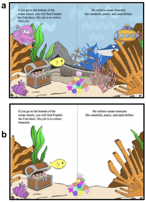
There is a ton of evidence to suggest that visual distraction in general has a negative impact on learning. Richard Mayer calls this the Coherence Principle – People learn better when extraneous words, pictures and sounds are excluded rather than included. In one study that supports this principle, it was found that young children’s comprehension of a picture book improved when extraneous details were removed from the illustrations.
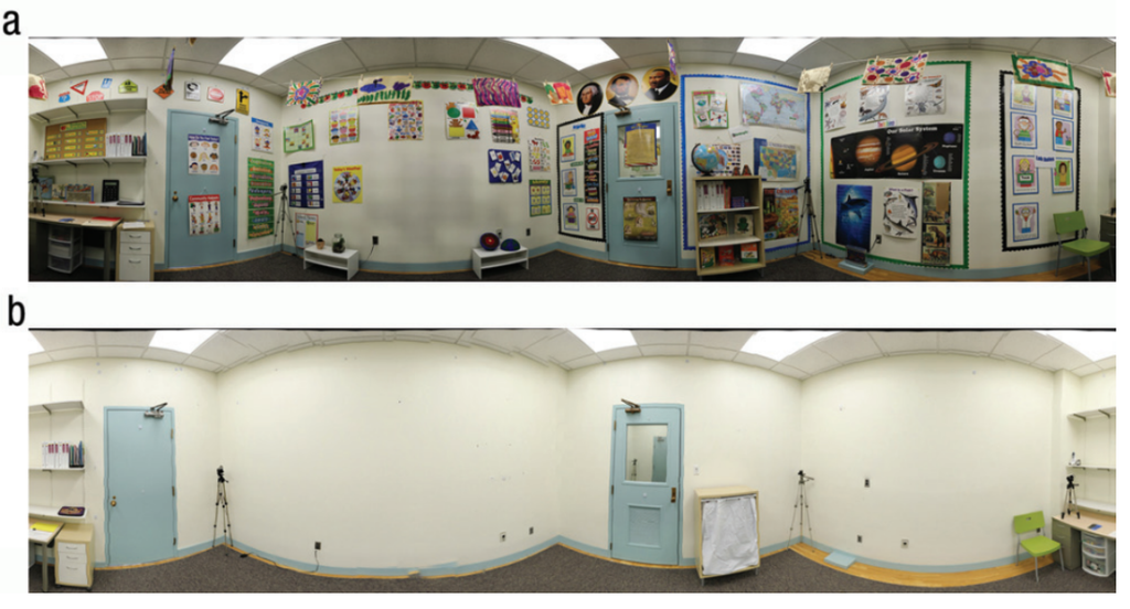
Further studies have found that reducing visual noise in the classroom environment also improves learning. In a much discussed study, students paid better attention during a science class and performed better on a subsequent test, when taught in a sparse classroom compared with a decorated classroom.
In his paper Learning: What Is It, And How Might We Catalyse It?, Peps McCrea summarises the evidence, suggesting that teachers harness and direct attention by eliminating redundant information and distractions in the environment, including, for example, display boards and clocks.
Reasons teachers put displays on walls
However, Dan Willingham cautions against using the research above to mandate completely bare walls and sterile environments: “Even if we accept that classroom decoration brings a cost to learning, we should remember that teachers have other reasons for brightening their rooms.” Here is my non-exhaustive list of the types of displays teachers put on walls.
- Displays that scaffold learning – This includes alphabets and anchor charts.
- Displays that make the classroom feel warm and inviting – This includes inspirational messages, bunting, plants.
- Student work that gives children a sense of belonging – This includes artwork, posters, writing.
- Displays that communicate learning topics – Often put up for the benefit of external visitors: parents, school leaders, etc.
How to optimise classroom walls for learning
Here are some ways that teachers can implement the evidence supporting the reduction of visual noise while taking into account the other important considerations listed above:
- CLEAN STAGE – You want to command attention when you are teaching from the front of the room, so that should be the barest part of the room. Displays that could distract students from the lesson at hand should be kept at the back or sides of the room, outside of children’s field of vision when they are attending to the teacher. The room taken as a whole will still feel warm and inviting.
- LESS IS MORE – Make the classroom feel pleasant with as few elements as possible. A single indoor plant can go a long way. Less Baz Luhrmann and more Marie Kondo.
- WALL TO HEAD – Remember that learning refers to what goes on in our heads, not what goes on the wall. Remove scaffolds that have become redundant (because students have learned the content well) or that interfere with retrieval practice; when you are asking review questions, you want students to search their memory, not turn and look at a display.
- CONTEXTUAL DISPLAY – If a visual scaffold is required for a particular subject or activity, put it away until you need to refer to it. You see this principle at play in modern video games and their use of dynamic HUDs. For example, in The Last of Us information such as your life meter and ammo count fade away during moments where the player is exploring an environment and reappear when the player enters “combat mode.” The classroom equivalent of this might be simply drawing a useful visual in a large A2 visual diary and flicking to that page as needed.
- DESIGN FOR CLARITY – Any displays that you do put on your classroom walls should follow Oliver Caviglioli’s 4 design principles: (1) cut out redundant information, (2) organise information into meaningful chunks, (3) align elements for easy visual navigation and (4) restrain the use of fancy fonts and colour.

Further reading
Classroom displays-Attraction or distraction? Evidence of impact on attention and learning from children with and without autism, by Hanley et al in Developmental Psychology | link
Visual Environment, Attention Allocation, and Learning in Young Children: When Too Much of a Good Thing May Be Bad, by Fisher, Godwin and Seltman in Psychological Science | link
What’s the impact of classroom displays on student learning? by Ollie Lovell | link
Are decorated classroom walls too distracting? by Daniel Willingham | link
Learning: What is it, and how might we catalyse it? by Peps Mccrea, Ambition Institute | link
Teachers’ views of their primary school classrooms by Barrett, Barret and Zhang, University of Salford | link
